Clash Royale Wireframe
& Prototype Redesign

Released in 2016, Clash Royale is a popular mobile strategy game that combines elements of collectible card games, tower defense, and multiplayer online battle arenas. Players collect and upgrade cards featuring troops, spells, and defenses, deploying them in real-time 1v1 or 2v2 battles. Despite its simple mechanics, the game offers deep strategic gameplay that has kept players engaged for years. In this project, I analyze several pain points and propose wireframe solutions to improve the user experience.

CLIENT
Personal Project

MY ROLE
UI/UX Designer

TEAM
Individual

TIMELINE
Several weeks, Spring–Summer 2025

Problem Discovery

Through analyzing community feedback, key issues with the current Clash Royale UI emerged, including crowded menus, confusing navigation, non-intuitive interface elements, and removal of beloved features enjoyed by millions of users. While users generally preferred the new UI, many still found it to be too cluttered with widgets.

Specifically, the Shop screen was often criticized for being cluttered with redundant in-app purchase options that could be handled externally, and some users felt the visual design, including tabs, looked "sketchy." The Collection screens presented challenges in easily switching between viewing and editing card collections, with users expressing a desire for older or more flexible deck builder options, and inefficient use of vertical space meant less content was visible at once. For Battle screens, users found it cumbersome to switch between different battle modes, with some noting the removal of 2v2, and even specific UI alignment issues like the arena not being centered.

Key Concerns:

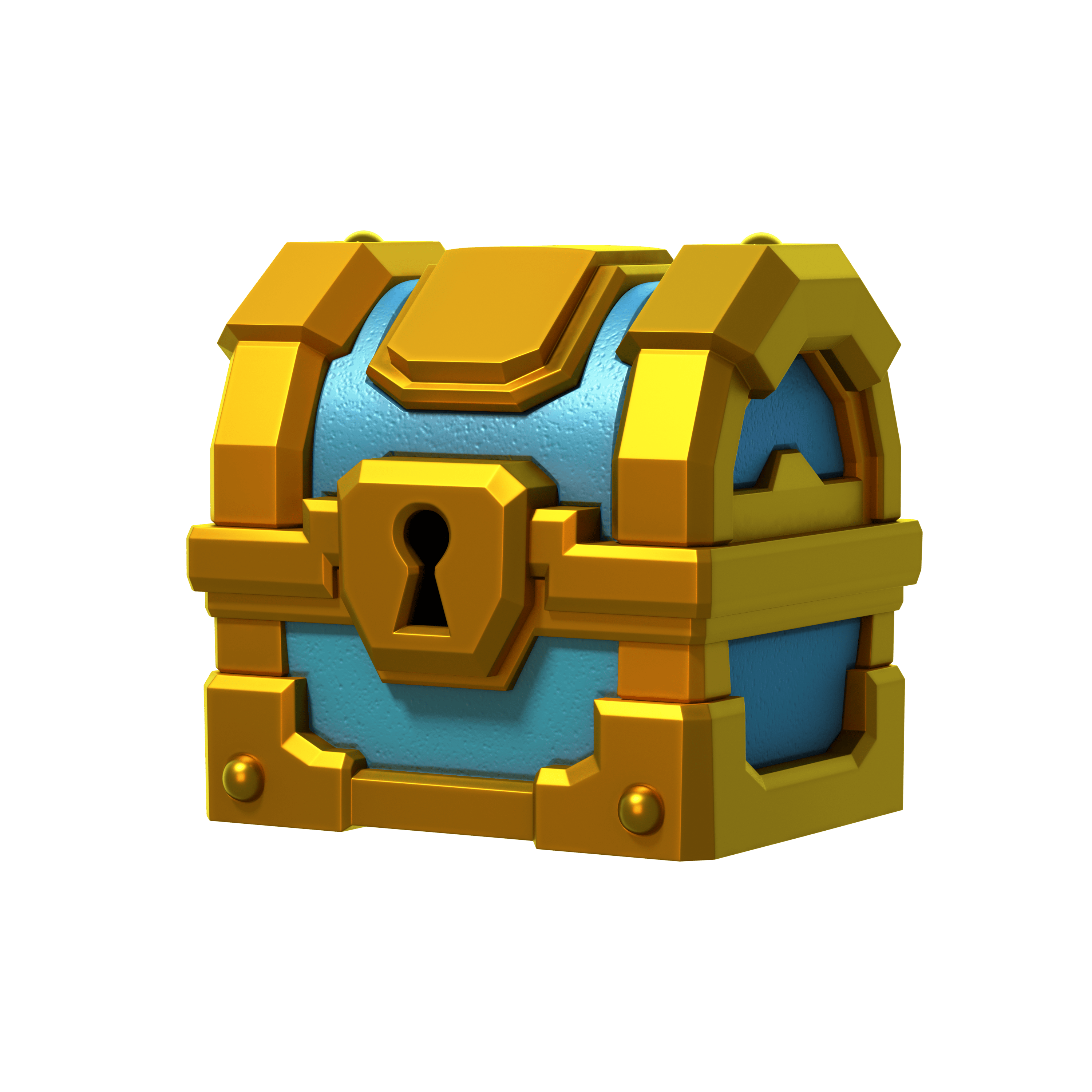
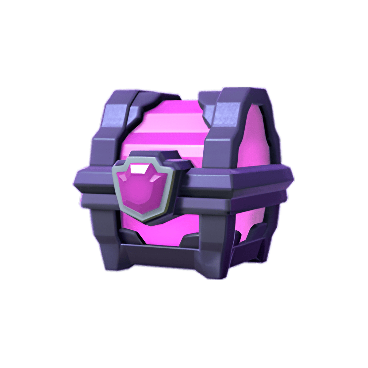
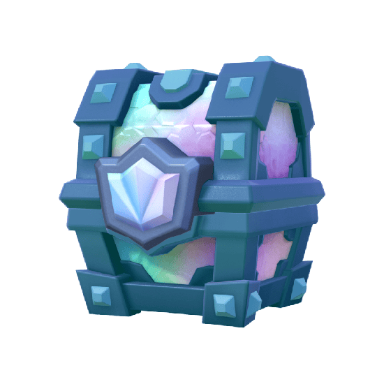
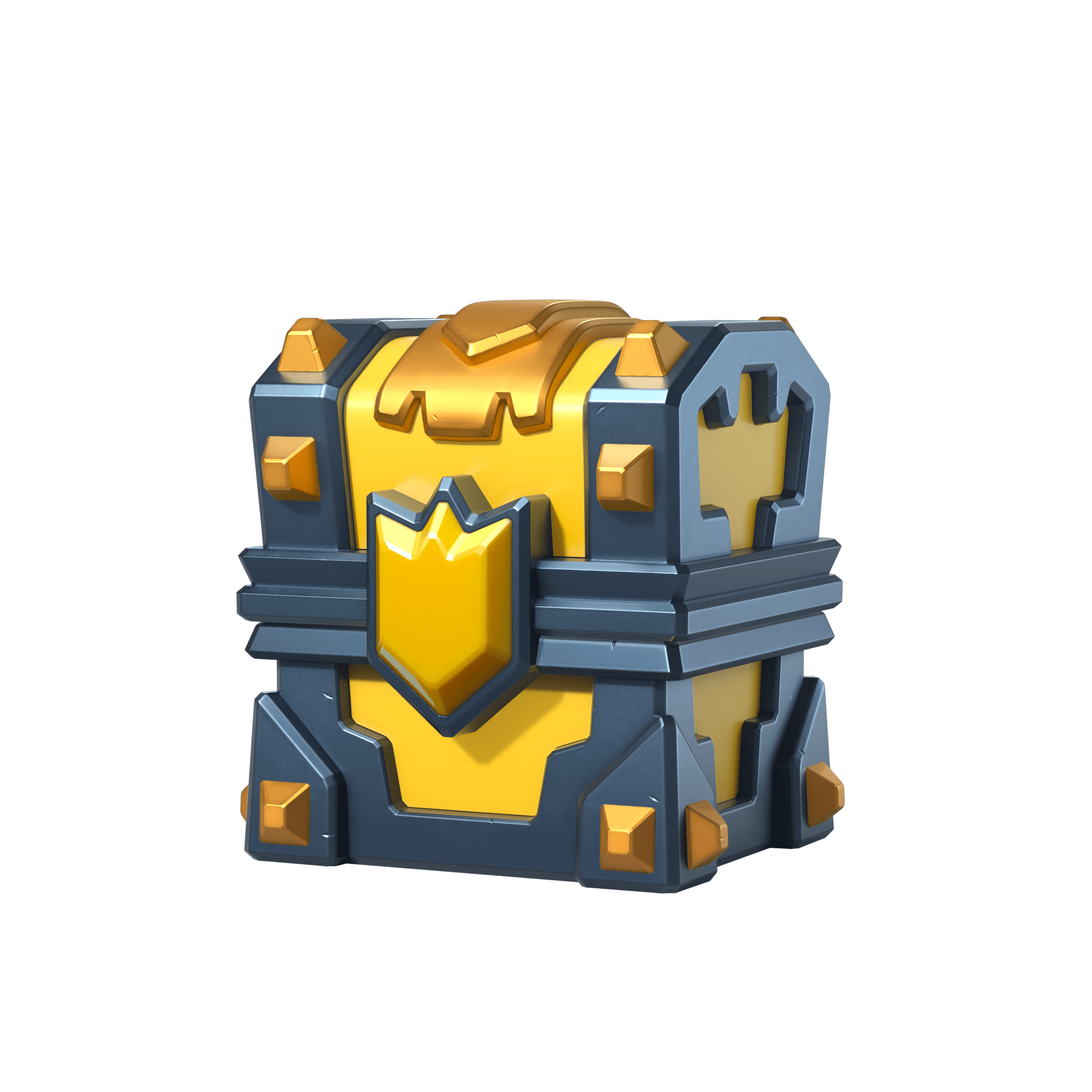
1. Removal of Chests: The elimination of the chest system and introduction of "Lucky Drops" has disrupted the sense of achievement and progression we once enjoyed."
— u/RedditUser1
"This update sucks.
-removed 2v2

What was the point of this update?"
— u/RedditUser2
"It was a bit less visually cluttered when they changed it, but now it's even more cluttered. I would be fine with the new Ul if they didn't make most of the tabs look like a sketchy webpage that definitely isn't downloading malware onto your computer."
— u/RedditUser3
Criticisms

Reddit User Feedback: UI/UX Criticisms of Game Update - Spring 2025

Design Process

I developed detailed screen diagrams and user flowcharts to iterate on the menu structure, navigation paths for features like deck creation and battles, and overall information hierarchy.

Diagram of Screens

This diagram illustrates the comprehensive number of screens and screen navigation within Clash Royale, detailing various paths and interactions throughout the game.

Screens Diagram
User Flow

User Flow Analysis -
Decks and Battling

I analyzed the existing user flow for deck management, noting a multi-step process that wasn't clearly conveyed to players. To streamline this, I've introduced 'Edit' and 'View' buttons within the Deck Creation/Editing flow.

Similarly, the 1v1/2v2 Battle flow provides easier navigation with a 'Battle' and '2v2 slider' button, addressing sluggish screen transitions and numerous steps that previously hindered quick adaptation during play sessions.

Comparisons

Comparisons Title Card

Side-by-side comparisons of the original UI and my improved wireframe. The minimal redesign focuses on streamlining navigation and improving visual hierarchy to enhance user experience.

Comparisons 1
Blue Crown Animated

Key Improvements

  • Shopping Screen:
    • - Removed visual clutter
    • - Eliminated redundant Pass Royale display
    • - Streamlined in-app purchases
    • - Optimized vertical space usage
  • Collection Screen:
    • - Reintroduced scrollbar for deck selection
    • - Added distinct Edit/View buttons for clearer navigation
    • - Reduced component sizes to display more content
  • Battle Screens:
    • - Implemented intuitive 1v1/2v2 slider navigation
    • - Removed interface widgets surrounding the Battle button
    • - Restored the classic Chest system that defines the Clash Royale experience
Wooden Chest Silver Chest Golden Chest Magical Chest Legendary Chest Champion Chest Red Animated Crown
Comparisons 2

Clash Royale Figma Wireframe & Prototype

This wireframe prototype demonstrates my UI/UX redesign approach for Clash Royale. I focused on reducing visual clutter, improving navigation patterns, and enhancing the core gameplay experience. Key improvements include streamlined shopping interfaces, more intuitive deck management with improved scrolling functionality, and redesigned battle screens featuring the classic Chest system that players love. The prototype allowed me to test these interface improvements before finalizing the design direction.

Reflection

This project taught me the importance of clear navigation, consistent iconography, and user feedback loops in mobile game interfaces. Iterating based on real user comments led to more intuitive designs.

Working in Figma allowed me to rapidly prototype and test different solutions, helping me develop a deeper understanding of mobile gaming UI/UX principles that I'll carry forward into future projects. The skills I gained in balancing aesthetic appeal with functional design have proven essential for creating interfaces that feel both visually compelling and effortlessly navigable.